Customize Text Cursor in Windows 11 for Visibility
Windows 11, Accessibility, Text Cursor
How to Customize the Text Cursor in Windows 11 So You Never Lose It Again
If you often find yourself squinting at the screen, wondering where that tiny blinking line has gone, you are not alone. The default text cursor in Windows 11 can be surprisingly easy to lose, especially on bright screens, high resolutions, or when you are multitasking. The good news is that Windows 11 includes simple accessibility options that make your text cursor bold, colourful, and almost impossible to miss.
Step 1: Navigate to Settings → Accessibility → Text cursor
Everything starts in the Settings app. Click the Start button and choose Settings, or press Windows key + I on your keyboard for a quick shortcut. In the left-hand menu, select Accessibility. This section is designed to help you tailor Windows to your comfort, and the text cursor options live here. Within Accessibility, scroll down until you see Text cursor, then click it to open a dedicated page of customization tools for that blinking line you keep losing.
Step 2: Turn on the Text Cursor Indicator for Instant Visibility
At the top of the Text cursor page, you will see a switch labelled Text cursor indicator. Turn this on. When enabled, Windows adds a small coloured shape on both sides of the cursor, like a friendly set of brackets around your typing position. This extra visual cue makes it much easier to spot the cursor at a glance, even in dense documents or long emails. It is a simple change, but many users find that this one switch dramatically reduces the time they spend hunting for where they last clicked.
Step 3: Pick a Custom Colour That Stands Out for You
Just below the indicator toggle, you can choose the Text cursor indicator colour. Windows offers several preset colours, plus an option to select a custom shade. Choose something that contrasts strongly with the backgrounds you use most. For example, if you spend your day in white documents, a deep purple or bright teal can be very effective. If you prefer dark mode, a light yellow or soft cyan might be easier on the eyes while still standing out. The key is to pick a colour that your eyes are naturally drawn to, so your cursor never blends into the page again.
Step 4: Adjust Cursor Thickness Until It Is Impossible to Miss
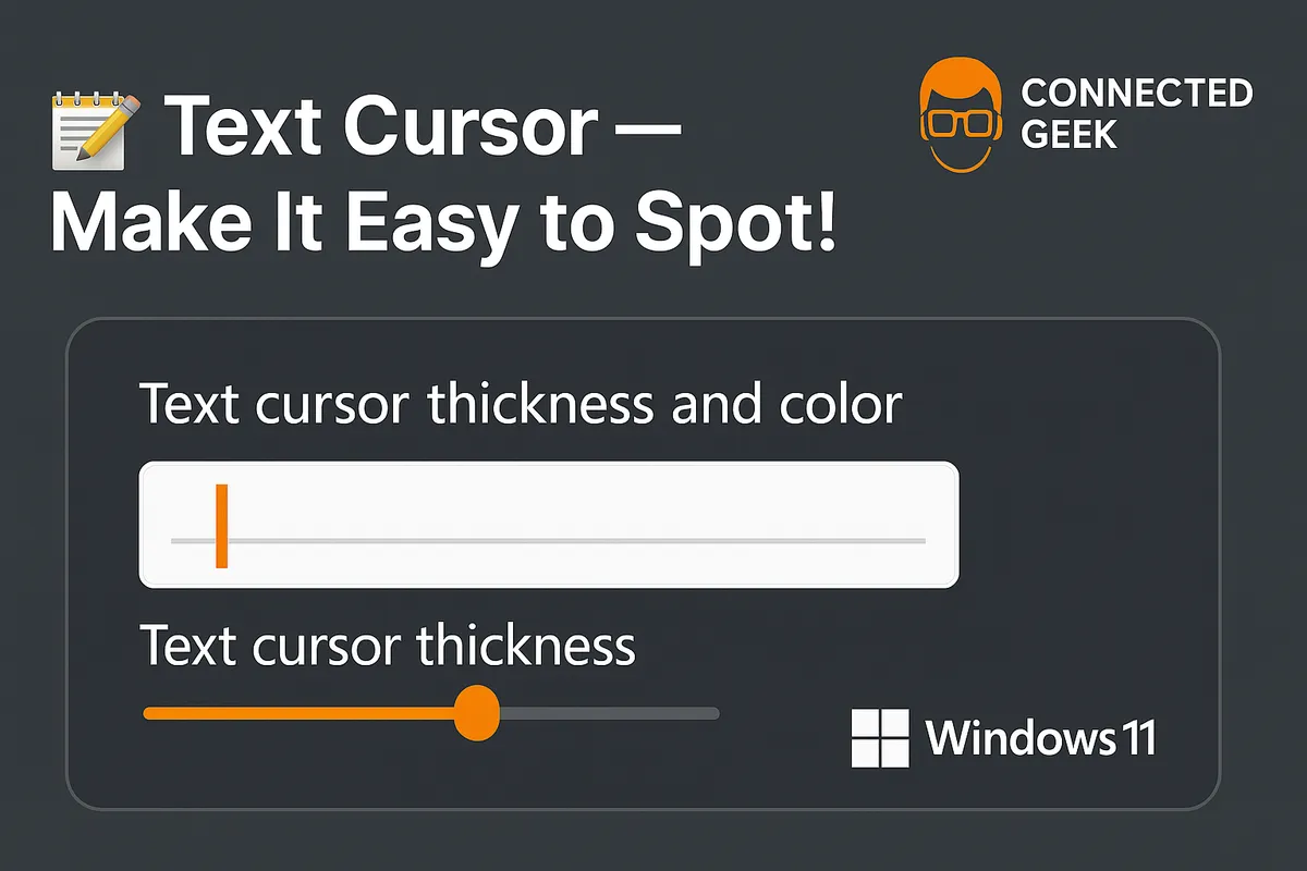
Colour is only half the story. Scroll a little further down and look for the Text cursor thickness slider. This controls how wide the blinking line itself appears. Drag the slider to the right to make the cursor thicker. As you adjust it, you will see a live preview, so you can stop as soon as it feels comfortable. A slightly thicker cursor can make a huge difference, especially on high-resolution displays where thin lines can almost disappear. Do not be afraid to go bolder than you think you need; the goal is a cursor that grabs your attention without feeling distracting.
Why These Changes Help If You Often Lose Your Cursor
Losing track of the cursor is more than a minor annoyance. It breaks your concentration, interrupts your typing flow, and can be especially frustrating during long work sessions. For people with visual fatigue, attention challenges, or simply busy, cluttered screens, that tiny default line is easy to overlook. By turning on the indicator, choosing a bold colour, and increasing thickness, you transform the cursor into a clear, stable reference point. Your eyes can snap back to it instantly, which means fewer interruptions, smoother typing, and less strain overall. In short, customizing the text cursor in Windows 11 is a small, friendly tweak that can make everyday computing feel noticeably calmer and more comfortable.
