Use Photo Filters in Windows 11 Photos App
Windows 11, Photos App, Editing Tips
How to Use Photo Filters in the Windows 11 Photos App
PublishedAt: 2026-05-26T11:00:00.000Z — Featured image: https://storage.googleapis.com/crm-conversations-ai-production/ask-ai-images/1778582439953/db556800-8abe-432e-8ac2-d1e82d6a6584.png
The Windows 11 Photos app has quietly grown into a surprisingly capable photo editor. You don’t need pro software to make your holiday snapshots, pet portraits, or food photos look polished and share‑ready. With a few taps in the built‑in Filters tools, you can completely change the mood of an image in seconds — and still keep it looking natural and true to life.
Getting to the Filters in Windows 11 Photos

First, let’s get you into the right place. Filters live inside the Photos app’s Edit view, so you’ll start there:
- Open your picture in the Photos app (double‑click it from File Explorer, or open Photos and choose the image).
- At the top, click Edit. This switches you into editing mode with several tools across the top or side.
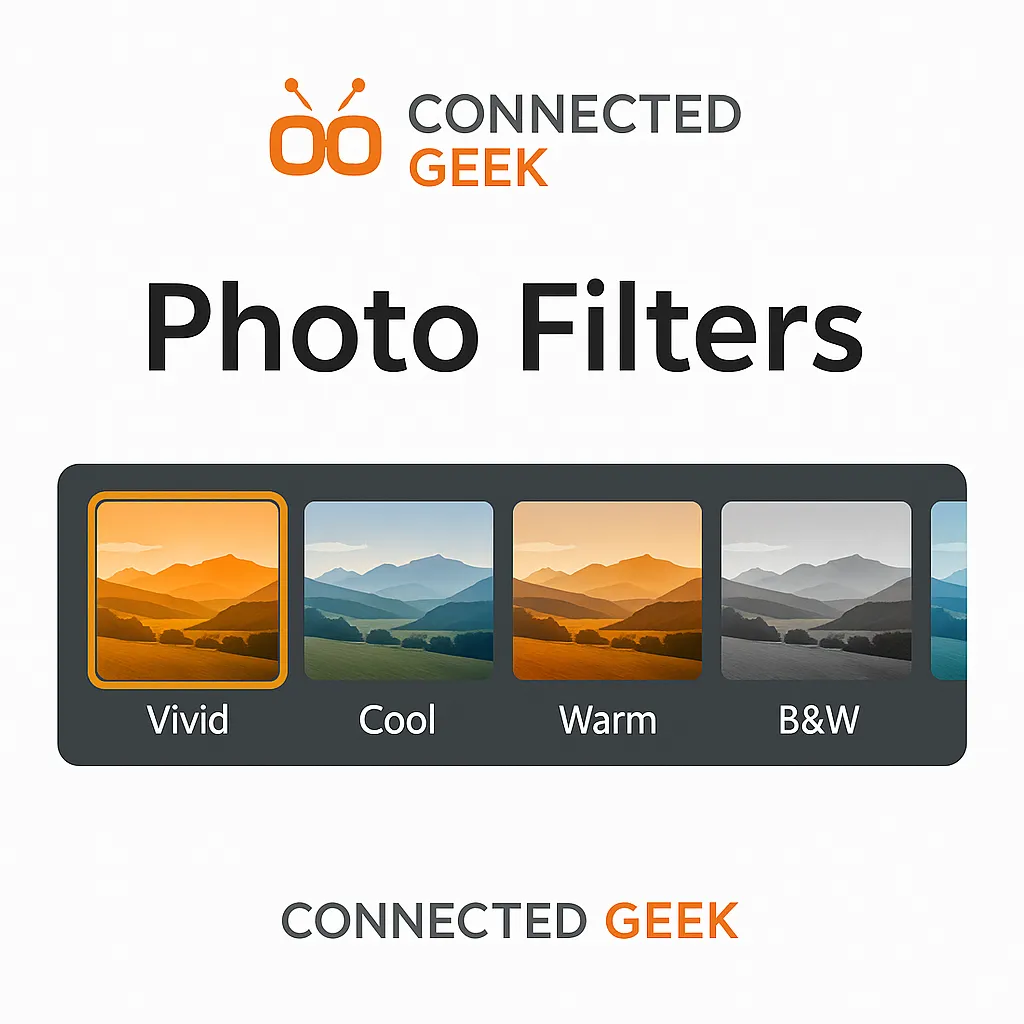
- Choose the Filters tab. You’ll see a strip of filter thumbnails, each showing a preview of how your photo will look.
From here, it’s all about experimenting. Click any filter thumbnail to see it applied instantly, and don’t worry — your original photo stays safe in the background until you decide to save.
What Each Windows 11 Filter Does
Windows 11 Photos keeps its filter set focused and practical. Here’s what each one is great for, in plain language:
- Vivid — Think of this as “turn up the energy.” Colours become more punchy and saturated, contrast increases, and the whole photo feels brighter and more alive. It’s ideal for festivals, colourful outfits, street scenes, and anything that should feel bold and fun.
- Vivid Warm — You get the same punchy feel as Vivid, but with a golden tint. Whites become slightly creamy, and skin tones often look richer. This is lovely for late‑afternoon light, beach days, and cozy indoor moments where you want a warm, welcoming atmosphere.
- Vivid Cool — Again, boosted colours, but nudged toward blue. It can make skies deeper, water more turquoise, and metal or glass more dramatic. Use this when you want a modern, slightly edgy look, especially in cityscapes and night photos with neon lights.
- Warm — This is your “sunrise or sunset in a button.” It adds a gentle golden cast without necessarily boosting saturation too much. It’s perfect when a daylight photo feels a bit cold, or when you want to enhance candlelight, sunsets, or autumn leaves without going overboard.
- Cool — The opposite of Warm. This shifts colours slightly toward blue, giving a crisp, wintery feel. Snow scenes, foggy mornings, and minimalist interiors often look cleaner and more refined with this filter, especially if the original shot is too yellow or orange from indoor lighting.
- Black & White — This removes colour entirely and focuses on light, shadow, and texture. It’s great when colour is distracting or when you want a timeless, dramatic look. Portraits, architecture, and high‑contrast scenes often shine in black and white.
- Sepia — Sepia adds a warm brown tint that mimics old photographs. It’s your go‑to for a vintage, nostalgic feel. Try it on family photos, historic buildings, or anything where you want a sense of “this has a story.”
Fine‑Tuning with the Intensity Slider
After you pick a filter, don’t forget the intensity slider. This little control is the secret to avoiding that “over‑edited” look. You’ll usually find it just below or beside the filter thumbnails once a filter is selected.
Drag the slider to the right to make the effect stronger, or to the left to dial it back. A good rule of thumb is to:
- Push the slider up until the photo looks almost too intense.
- Then gently pull it back until the effect feels natural again.
This way, you keep the character of the filter without making your photo look fake. For portraits and food, a lower intensity usually works best; landscapes and city scenes can often handle a bit more punch.
Combining Filters with Adjustments for a Custom Look
Filters are a great starting point, but the real magic happens when you pair them with the Adjustments tools in Edit mode. After choosing a filter, switch to the Adjust tab (or similarly named section) to tweak things like brightness, contrast, exposure, highlights, shadows, and clarity.
- If Vivid makes your image a bit too bright, lower the Brightness or Highlights slightly to bring back detail in the sky or skin.
- If Black & White looks flat, increase Contrast or Clarity to add drama and definition.
- When Warm makes things too orange, gently nudge the Temperature back toward neutral until skin tones look right again.
Think of the filter as your “overall style,” and Adjustments as the fine‑tuning knobs. Spend a minute or two experimenting, and you’ll quickly get a feel for how small tweaks can make a big difference.
Choosing the Right Filter for Different Types of Photos
Not every filter suits every photo. Here are some friendly starting points you can try, based on what you’re editing.
Landscapes and Nature
For landscapes, you usually want rich colours without losing the natural feel:
- Vivid or Vivid Cool for blue skies, oceans, and mountains.
- Vivid Warm or Warm for sunsets, autumn forests, and golden fields.
Keep the intensity moderate, then use Adjustments to slightly boost contrast and clarity for extra depth.
Portraits and People
With faces, subtlety is your friend. Over‑saturated skin can quickly look unnatural:
- Try Warm at low intensity for flattering, gentle tones.
- Use Black & White for moody, artistic portraits, especially when the background is busy.
Then tweak Exposure and Shadows to keep details around the eyes and hair without blowing out the highlights on the skin.
Food and Close‑Ups
Food photos should look tasty, not radioactive. A gentle touch works wonders:
- Vivid Warm at low intensity for rich, appetising colours.
- Warm for cozy coffee shots, baked goods, and candlelit tables.
After the filter, lightly boost Clarity or Sharpness to bring out textures like froth, crumbs, and garnish.
Architecture and City Scenes
Buildings and streets can handle stronger styles, especially when lines and shapes are the stars:
- Vivid Cool for glass, steel, and night scenes with neon lights.
- Black & White or Sepia for historic buildings and old streets where texture and mood matter more than colour.
Pair your chosen filter with higher Contrast and a touch of Clarity to emphasise lines, patterns, and reflections.
Wrap‑Up: Play, Compare, and Trust Your Eye
The best way to get comfortable with filters in Windows 11 Photos is simply to play. Try a filter, adjust its intensity, add a few tweaks in Adjustments, then use the before/after view to compare your edit with the original. If it looks better and still feels like the real moment you captured, you’re on the right track.
With just the Filters tab, the intensity slider, and a bit of experimentation, you can turn everyday snaps into photos you’re proud to share — all without leaving Windows 11.
