Microsoft Word for Beginners: Format Text Clearly
Good formatting helps readers find the important parts of a document without you rewriting a single word. A bold heading tells the eye where to start. A consistent font keeps the page calm. A centered title signals that something new begins here.
Today's Microsoft Word lesson covers the basics: selecting text, choosing a font and size, using bold, italic and underline, and aligning paragraphs. Everything we need lives on the Home tab, which you met in the workspace tour on Sunday.
The lesson in short
Formatting can help readers spot what matters without changing your words. Today’s Word lesson explores selecting text, using font and size controls, and aligning a paragraph from the Home tab. A few consistent choices keep a page easy to read.
Step by step
Select the text you want to change. Drag across it with the mouse, or double-click a single word. Word applies formatting to whatever is selected.
Open the Home tab. Look for the Font group. It holds the font name, the font size and the Bold, Italic and Underline buttons.
Choose a font and a size. Pick a readable font and a size that suits the text. Body text is often between 10 and 12 points, and headings are usually a little larger.
Apply bold, italic or underline. Click the matching button in the Font group, or use the keyboard shortcuts in the quick tip below.
Click inside a paragraph to align it. Alignment is in the Paragraph group on the Home tab, and it applies to the paragraph where your cursor sits.
Select several paragraphs to align them together. If you want more than one paragraph aligned the same way, select all of them first and then choose the alignment.
Check the page as a reader would. Step back and ask whether your eye is drawn to the right places. If everything stands out, nothing does.
Why formatting matters to your reader
Readers scan before they read. A page with a clear heading, tidy paragraphs and a few well-chosen emphasized words lets someone grasp the point in seconds. A page with five fonts and every line in bold forces them to work harder.
Formatting does not change what you say. It changes how easily it is found. That is why a few consistent choices usually beat lots of decoration.
Fonts, sizes and the Font group
The Font group is the home of character formatting. The font name box sets the typeface, and the size box sets how large the characters are. Both apply only to the text you have selected, so select first and then choose.
A helpful rule is to use one font for body text and, at most, one more for headings. Keeping choices consistent makes a document look professional even when the content is simple.
Bold, italic and underline, used sparingly
Bold suits headings and a few key terms. Italic suits titles of works or gentle emphasis. Underline is best used rarely, because readers often confuse underlined text with a link.
The goal is a little emphasis. A handful of bold words helps readers notice key details, while too much emphasis makes a document harder to scan.
Aligning paragraphs
The Paragraph group controls how a paragraph sits on the page: left, centered, right or justified. Left alignment is the easiest to read for most body text. Centered text suits titles. Remember that alignment applies to the paragraph holding your cursor, so you do not need to select every word, but you do need to select several paragraphs to align them together.
If you like keyboard shortcuts, Ctrl+L aligns left, Ctrl+E centers, Ctrl+R aligns right and Ctrl+J justifies.
Copying formatting and starting fresh
Once you have a heading that looks right, the Format Painter on the Home tab can copy its formatting to other text. Select the formatted heading, click Format Painter, and then select the text that should match. It saves you from repeating each step.
If you ever want to undo your formatting choices and start again, select the text and use the Clear All Formatting button in the Font group. It returns the selected text to a plain look so you can begin again.
A real-world example
Imagine you are writing a one-page price list for a small shop. You type the title and select it, then choose a slightly larger size and bold. You center it with the alignment button. Each category name gets the same bold treatment, so customers can scan the page in seconds. The prices stay in regular text, and the whole page looks organized without a single extra word.
Common mistakes and how to fix them
Emphasizing whole pages. A little emphasis helps readers notice key details. If a whole page is bold, nothing stands out. Reserve bold for headings and a few important words.
Forgetting to select first. Formatting applies to the selected text. If nothing happens, check that the text is highlighted.
Mixing too many fonts. Stick to one body font and, if you wish, one heading font. Consistency keeps the page readable.
Using underline for emphasis. Readers may mistake underlined words for links. Bold or italic is usually a clearer choice.
Quick tip of the day
Need a quick emphasis in Word? Select text, then press Ctrl+B for bold, Ctrl+I for italic, or Ctrl+U for underline. Press the same shortcut again to turn it off.
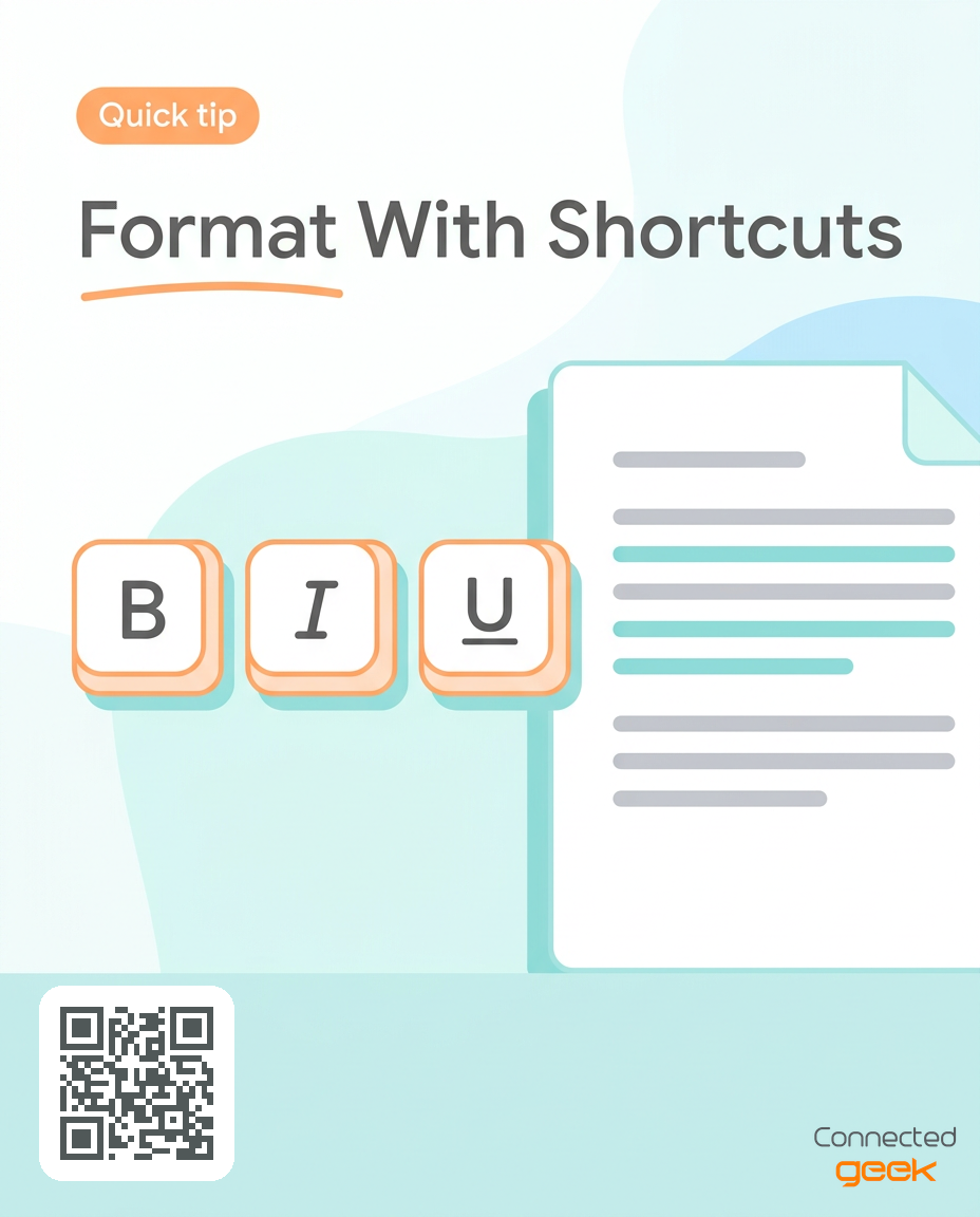
If no text is selected, the shortcut changes the formatting for what you type next. Use these shortcuts on a small number of words rather than whole pages.
Frequently asked questions
How do I make text bold in Microsoft Word?
Select the text and click the Bold button in the Font group on the Home tab, or press Ctrl+B. Press the same shortcut again to turn bold off.
Why did my formatting not change?
Formatting applies to the selected text. Make sure the words are highlighted before you click a button or press a shortcut.
How do I align just one paragraph?
Click anywhere inside that paragraph and choose an alignment in the Paragraph group. You do not need to select the whole paragraph.
How do I align several paragraphs at once?
Select all of them first, then choose the alignment. They will all change together.
What if I type and the formatting is not what I expected?
If no text was selected when you pressed a shortcut, Word changed the formatting for the next words you type. Press the shortcut again to turn it off.
Key takeaways
Select text first, then apply formatting from the Home tab.
The Font group holds font, size, bold, italic and underline.
Alignment is in the Paragraph group and applies to the paragraph where your cursor sits.
Ctrl+B, Ctrl+I and Ctrl+U apply bold, italic and underline, and the same shortcut turns each off.
Consistent, restrained choices make a page clearer without changing a word.
Try it now
Type a short heading and a sentence beneath it in Microsoft Word. Select the heading, make it bold and slightly larger from the Home tab, and leave the paragraph below regular. Then center the heading by clicking in it and choosing center alignment.
Where to go from here
Consistent formatting gives readers useful visual cues without changing a single word. Tomorrow we take structure one step further with styles and headings, which make longer documents far easier to organize.
Find more lessons and tips at https://connectedgeek.net, and each day's lesson also arrives by email and on our social channels.
Need help? Call 248-648-1717 or email [email protected].
