Discover iOS 26: Smarter, Prettier iPhone Tab Bars
iOS, iPhone Tips
iOS 26 Tab Bars — The Smarter, Prettier Way to Navigate Your iPhone
iOS 26 quietly changes something you touch every few seconds on your iPhone: the tab bar. It’s smarter, softer, and surprisingly delightful — the kind of update you don’t realize you love until you pick up an older phone and wonder why everything suddenly feels… clunky.
How the new intelligent tab bars actually work
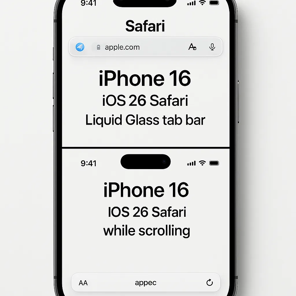
In iOS 26, tab bars feel almost alive. As you scroll down through a long page or list, the bar at the bottom doesn’t stubbornly stay full size anymore. Instead, it gently shrinks into a compact strip, hovering just above your content. You instantly get a bit more screen to read or browse, without losing your way home.
Start scrolling back up, or give the bottom of the screen a quick nudge, and the bar smoothly expands again. The icons spread out, labels reappear, and everything is easy to tap, just when you’re ready to switch tabs or jump somewhere else. It’s like the iPhone is reading your intent: focused on content when you’re immersed, focused on navigation when you’re ready to move.
What changed from the old iOS 18 tab bars
If you remember iOS 18, tab bars were basically fixed billboards. They sat at the bottom, always visible, always the same chunky height, no matter what you were doing. Reliable, yes — but not exactly subtle. On smaller iPhones, they often felt like they were stealing precious lines of text or photos you wanted to see.
With iOS 26, Apple leans into a more fluid, “Liquid Glass” look, as highlighted in their iOS 26 announcement (Apple Newsroom). Tab bars now float above your content and react to your scrolling instead of ignoring it. Same navigation, but it feels lighter, more modern, and far less in the way.
Why this tiny change matters so much
On paper, shaving a bit of height off a tab bar doesn’t sound dramatic. In everyday use, it’s huge. You get more content on screen — an extra line of text in an article, one more photo in a grid, a little more of that email you’re scanning. On smaller iPhones, that extra breathing room feels especially welcome.
At the same time, navigation never feels hidden or buried. The compact bar is still there, hovering at the bottom, ready for a quick tap. It’s a sweet spot between “always visible” and “annoyingly in the way” — and once you get used to it, fixed bars on older iOS versions suddenly feel downright clumsy.
Where you’ll see the new tab bars today
Apple is already rolling this behavior into its biggest apps. You’ll notice the new floating, shrinking tab bars in Safari, Apple Music, Mail, Photos, and Messages, with more stock apps picking it up over time. Open a long email thread, scroll through your camera roll, or browse a playlist — you’ll see the bar quietly step back, then glide forward again when you need it.
The Liquid Glass look: soft, glowy, and a bit magical
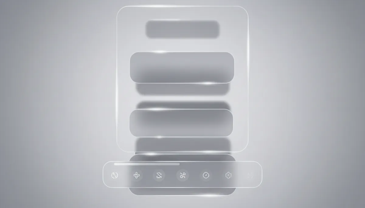
Visually, the new tab bars embrace iOS 26’s Liquid Glass aesthetic. They’re translucent, with a subtle glassy blur that lets your content peek through. As you scroll, colors and shapes from the page or photo behind the bar softly shift, almost like reflections on frosted glass. Active icons get a gentle glow, and the tint often echoes your wallpaper or app accent color, keeping everything feeling cohesive and calm rather than loud.
So natural you only notice it when it’s gone
The most charming thing about these new tab bars is how quickly they disappear into the background of your brain. After a day or two, the shrinking and expanding feels so natural you stop thinking about it entirely — it just matches how you use your phone.
Then you pick up an older iPhone, or one still on iOS 18, and that old, chunky fixed bar suddenly feels like someone left a brick on your screen. That’s when you realize: this isn’t just a pretty design tweak. It’s a small, thoughtful change that makes every scroll, tap, and swipe on your iPhone feel a little more effortless — and once you’ve lived with it, you won’t want to go back.
