iOS 26 Home Screen: Major Visual Refresh Unveiled
iOS, Home Screen Customization
iOS 26 Home Screen — Everything That Changed
iOS 26 gives the iPhone Home Screen its biggest visual refresh in years. Apple’s new Liquid Glass design language reshapes icons, widgets, the Dock, and even how your wallpaper interacts with everything on screen, while new layout tools make it easier to build a Home Screen that feels uniquely yours.
Liquid Glass app icons: translucent and alive with your wallpaper
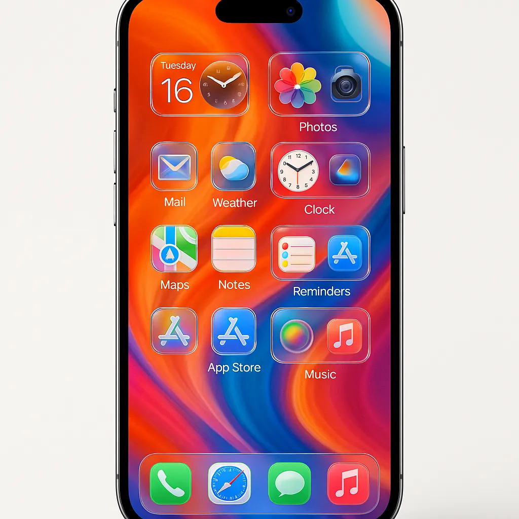
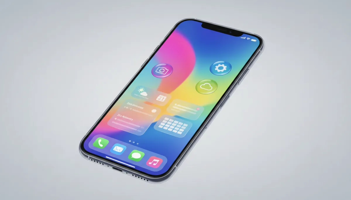
The most striking change in iOS 26 is the introduction of Liquid Glass app icons. Instead of flat blocks of color, icons now look like tiny glass tiles layered above your wallpaper. They are subtly translucent, letting background colors and patterns show through while keeping each app’s logo crisp and recognizable (MacRumors).
Apple offers several appearance modes. Beyond the familiar Light and Dark looks, there are new Light Tinted and Clear styles. In Clear mode, icons become almost fully transparent, borrowing their color from your wallpaper with simple white artwork on top. Subtle lighting and depth effects shift as you move your iPhone, making the grid feel more dimensional and “alive” (Apple Support).
New icon size and grid options for cleaner layouts
iOS 26 finally gives you more control over how dense or minimal your Home Screen feels. You can increase icon size for easier tapping or a bold, poster-like look, or keep them smaller to fit more apps on a single page. There’s also the option to hide app labels, which pairs beautifully with Liquid Glass icons for a clean, gallery-style layout (App Store feature).
Grid flexibility has improved as well. Apps and widgets are no longer locked to strict rows starting from the top. You can leave intentional gaps, center a small cluster of icons, or frame your favorite part of the wallpaper by keeping that area clear. This makes your layout feel less like a spreadsheet and more like a thoughtfully arranged home screen design.
Smarter widgets with new Clear styles and free placement
Widgets have been redesigned to match the Liquid Glass language. In Clear mode, they become glassy panes that seem to float above your wallpaper, echoing its colors while keeping text and controls readable (MacRumors).
Placement is more flexible too. You can drop widgets into almost any open space, mixing sizes to create a dashboard that feels tailored rather than forced into a rigid grid. Combined with new widget types like enhanced Photos and Ambient Music widgets in later iOS 26 updates, your Home Screen can act as both a control center and a personalized display (9to5Mac).
A redesigned Dock with Liquid Glass depth
The Dock now fully embraces Liquid Glass. Instead of a flat pill, it appears as a frosted glass shelf with soft reflections and highlights that respond to motion. Its tint is directly influenced by your wallpaper, so a blue gradient background might give the Dock a cool, icy look, while a warm sunset photo produces a subtle amber glow (MacRumors).
App Library improvements for faster access
Behind the main pages, the App Library also benefits from iOS 26’s refinements. Categories are easier to scan, with clearer labels and more consistent grouping. Search feels faster and smarter, surfacing recently used or contextually relevant apps more reliably. The visual style now aligns with Liquid Glass as well, so jumping from Home Screen to App Library feels seamless instead of jarring.
Customizing with the updated long‑press edit mode
Long‑press anywhere on the Home Screen to enter the refreshed Edit mode. From here you can:
- Switch icon appearance between Light, Dark, Light Tinted, and Clear
- Adjust icon size and toggle labels on or off
- Reposition apps and widgets freely, leaving intentional empty space
- Edit the Home Screen wallpaper in place, including blur, tint, and gradients, without touching the Lock Screen
This in-place wallpaper editing is especially powerful: you can dial in just the right amount of blur or color wash so icons and widgets pop while your favorite photo still shines through (MacRumors).
From flat to dimensional: the new iOS 26 vibe
Overall, iOS 26 marks a clear shift from the purely flat look of earlier versions to a more dimensional glass aesthetic. Layers of translucency, motion‑responsive lighting, and wallpaper‑aware tinting make your Home Screen feel like a cohesive scene rather than a collection of separate parts. For iPhone users who love to customize, this update delivers both fresh style and genuinely useful control over how your Home Screen looks and works every day.
